Raise.Dev

Redesigning a digital experience for a developer mentorship platform

Front-endDesign SystemProduct DesignBrand Strategy

Overview

Raise.dev is focusing on helping professional developers advance their careers, through on-demand pair programming, longer-term coaching relationships, and employment opportunities.
Working cross-functionally with the founder, product and engineering, I created the end-to-end experiences of the following features:
01
Marketing landing pages
02
Defining a user experience for the developer onboarding flow
03
Establish a working design system from scratch
Due to NDA restrictions, I can not disclose all the details of my contributions.
Skill set
Interaction & visual design, Brand identity, UI/UX design, Design system, Product thinking, and Front-end development
Timeline
June 2020-June 2021 (1 year)
Platform
Web (Product) raise.dev
Tools
Figma, Notion, Ruby on Rails, TailwindCSS, Stimulus.js, Git, and GitHub

my role

as the sole UI/UX designer, I

01
Designed systems for the internal and external user experiences
Conducted user research, synthesized qualitative data to identify feature specifications for the marketing pages, and wireframing. Also responsible for creating a design system for the Raise.dev design foundations.
02
Created the branding and facilitated in the strategy for marketing the product
Responsible for branding, creating the style guide, designing the marketing landing pages and also collaborated with the Chief Operating Officer in creating the email drip campaign.
03
Designed and implemented the user interface
Facilitated in building the front-end for the landing pages. Worked closely with the lead developer to create a design system for the app’s front-end that was built by views (ViewComponents) for the Raise.dev design foundations.

01 marketing

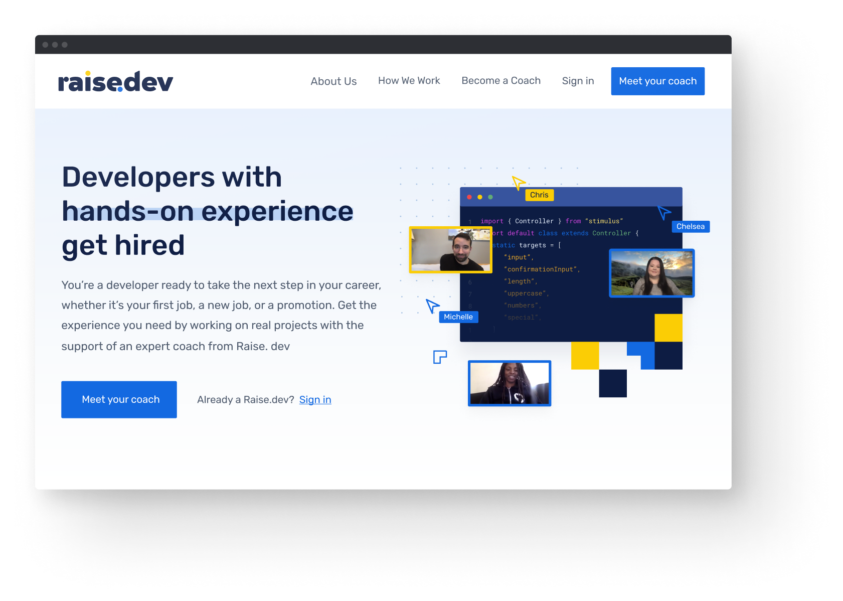
Redesigning Raise.dev and implementing a visual tone and language that speaks to the developer education space

log in screens

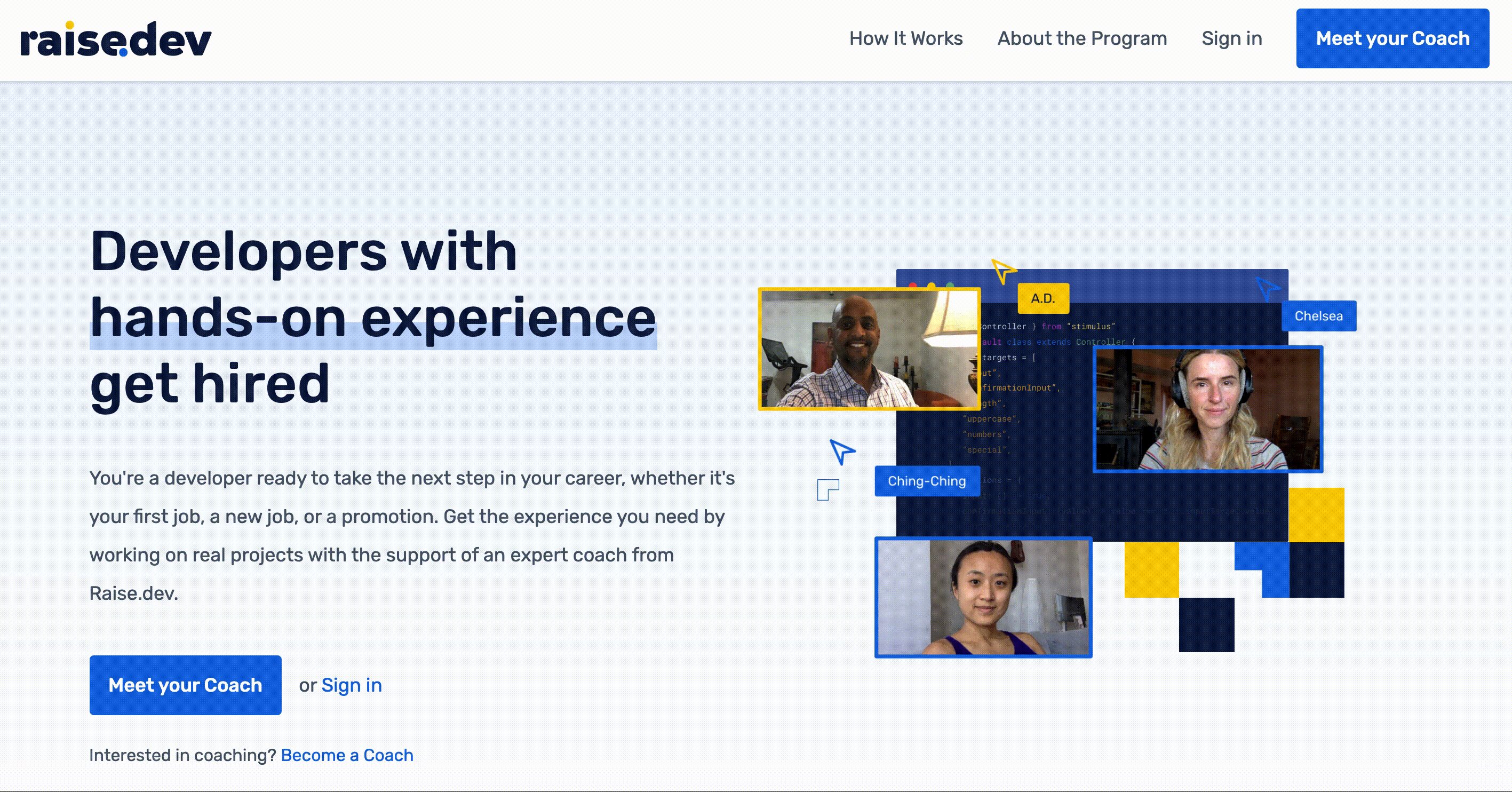
Developers who need a second set of eyes to take the next step forward

The previous website was a static page and offered little to no information relating to the product they were offering. In addition to landing, an MVP for an internal coaching platform was needed to facilitate the existing mentorship program.

The problem I was on boarded to help solve was how might we brand and market Raise.dev as a platform that focuses on helping professional developers advance in their careers.

During the ideation process, I presented mockups to the team to get their feedback, where I was then able to create further definied hi-fi's.

As the sole designer, the design process was still important to work on as a team, as their feedback provided effective changes to the appearance of the mockups and to the live site.

Building the brand identity from scratch that’s familiar to the developer world

To set the developer tone, using a mono typeface was a certain choice, and in combination with a round and bold sans serif to go easy on the eyes.

The selected colors were calm, yet with an electrifying blue, accompanied with a bright, yet, a warm yellow. These color pairings are settled down with a dark navy, that’s used in the heading styles across the Raise.dev platform. Tertiary and accent colors were used to facilitate in the brand illustrations.

02 UX Flow

Defining a user experience for the developer onboarding flow

log in screens

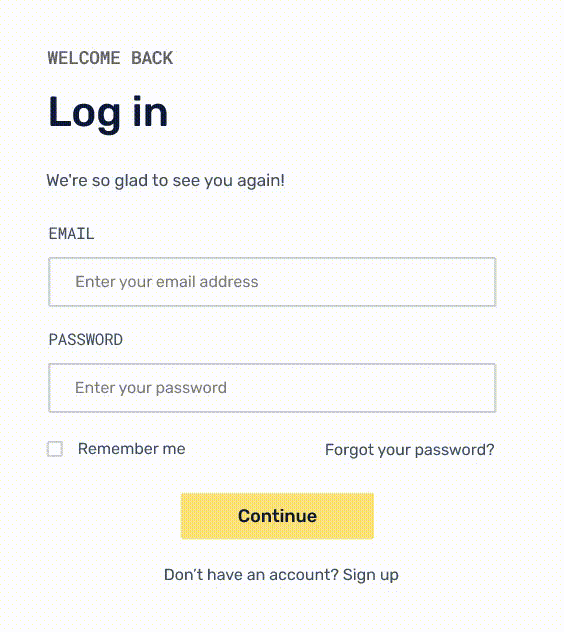
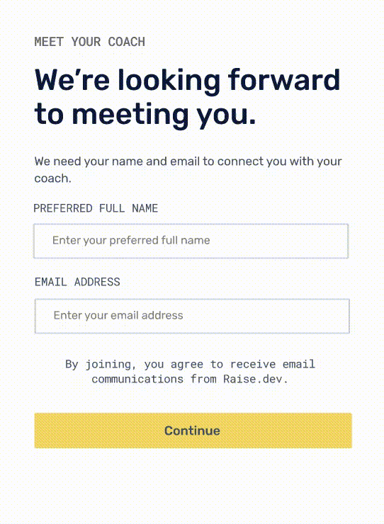
Task analysis for new users signing up onto the platform

Designing the user experience for the new users signing up and logging in, I worked closely with the lead back-end developer and the founder, to create a step-by-step analysis of how a user will interact with the Raise.dev platform in order to reach their goal.

The MVP relied on getting as many users onboarded onto the platform and in order to understand how to build the sign up feature, by creating a user flow helped to visualize the steps needed for new and invited users and for existing users.

03 Design System

A design system providing a 1:1 design to development relationship

Design system overview

As the product grows, there would need to be consistent styling for the Raise.dev platform. The team faced 2 issues:

01
Lack of consistency
The process of design to development grew into loosing out on best possible designs and front-end best practices. Elements in our code base were repeatable and the developers applied their own way to implement styles that may have already been implemented on other pages. This evidently led to an unmaintainable code base for our front-end styles.
02
An unorganized design system
The team had trouble locating styles and components needed when developing them. Locating the correct file to implement the styles can be located in multiple pages in the Figma workspace, and often times, we found missing pieces that end up needing to be recreated and then documented for its use cases.
Approach design and development through design systems thinking to create a component library for a component-driven development.

Proposed solutions

The solution was to organize the files, which would lead to better locating the components needed. The way we organized our files was a core factor in building the design system. The goal would be for anyone to have the ability to pull atoms or component pieces together to create the intended feature. This will also allow for the designer to quickly create components if we need anything new or to update an existing piece.

By componentizing our design, we are optimizing the way we design atoms, components and slices to build the front-end as well.
Review & extract existing components
I extracted components, from the Figma files and the public site, in a systemized flow in Raise.dev’s project file in Figma, using a 3 layer design system our team adapted from Brad Frost’s Atomic Design System:
Labelling files for a 1:1 design to development relationship
I corrected the labelling of the components to have the same name in the design system. This is for creating a consistent naming convention, for design and development as well.

Goals & Guidelines

Organizing the assets and files assets was a core value in building the design system, where the goal would be for anyone in the team to have the ability to pull components and piece together a completed piece. Allowing for an efficient and quicker way in creating components. We considered the following criteria in measuring the success of the design system:
01Design language
From typography, colors, iconography, card styles, and shadows, are they consistent and follow the current branding?
02Design tokens & core components
Have we extracted all of the components to create a base guideline that will be used to create higher components?
03Functionality
We questioned almost every component that was originally created. Do we need this component? Is this component utilized anywhere else on the public site?
04Documentation & guidelines
Have we provided components with the correct name and are we addressing the right naming convention for both design and in the code base? Have we documented the use cases for the core components?

Outcomes

Creating the design system, through the process of constant iterations, design critique and feedback from the team, the Raise.dev design system allows for developers and product owners to strengthen the quality of product. No doubt will this create a richer user experience while using the Raise.dev platform.
For a successful design to developer collaboration, consistency in our designs were imperative. I designed the style guide early on, in such a way, that was helpful for when we were ready to create a design system.
This feature is an on-going project and the following visuals are snippets of the progress and outcomes that were made.

Raise.dev Design System

Reflection

The development of the design system required close involvement from product owners and the developers. Our team was small but we needed to communicate frequently because each decision we made would certainly impact the use and outcome of using the design system. I learned from this experience how to communicate early and to ask any questions or doubts I may have had through the process. I worked closely and alongside the product owner and lead developer, with sync-up meetings to ensure everyone was on the right track in building this feature out.
The outcome of the design system wasn't fully completed but it was enough to get the team started and organized on the design components. I'm thrilled to have taken a large role on this and for the communication and teamwork experiences I've gained from it.

Retrospective

Executing the MVP amidst the chaos of a global pandemic

01
Asynchronous work setting
The pandemic undoubtedly altered the way people and companies work, collaborate and communicate together. As a new team, we held multiple activities such as daily Slack standups, which eventually switched to vieo call standups (we found to enjoy seeing each other, even if it was for a short time, to chat, laugh, and tackle quick questions); and we held end of sprint retros to recap on “what went well, what didn't, and what did we long for“. We also added more recurring scheduled meetings. In all, there were forms of communication we learned to handle synchronously and asychronously.
02
Consistency in design and a design system
We knew the importance of a design system knowing the value it would offer for the overall brand consistency across the platform. It helped to build consitency in development as well. The goal to tackle the design system early on is to further iterate and to better implement components when adding new features, and especially for when the product scales bigger.
03
Design to developer handoff
Friction is easily spotted between designers and developers since both perform different tasks and can view the same challenge very differently. Communicating and reducing any knowledge gaps will lead to better results. My experience with this is learning to hold conversations early on to decrease the chances of the unexpected. Other things include: providing all design files and necessary documentation in GitHub issues and hold meetings with the right people to sync up.